Overview
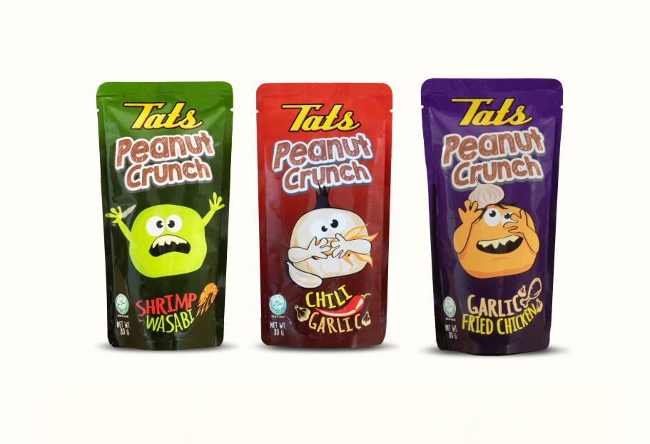
Packaging design for Tatz Peanut Crunch created for client Tobi Philippines. Three bold flavor variants — each with a unique character mascot — designed for maximum shelf appeal, brand consistency, and visual storytelling.
Flavor Variants
Each variant features a distinct color and character mascot — green for Shrimp Wasabi, red for Chili Garlic, and purple for Garlic Fried Chicken. The playful illustrations and bold typography create a fun and memorable brand experience.
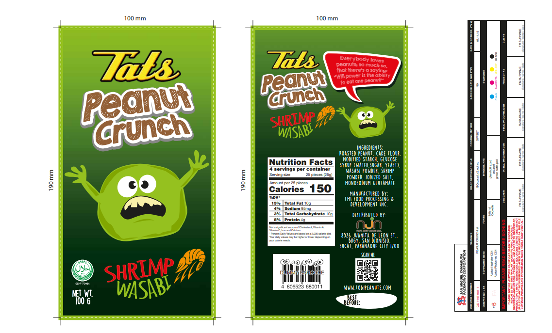
Packaging Compre Layout
Before presenting to the client, a comprehensive layout — or "compre" — is prepared showing all panels of the package laid flat. This includes the front, back, and side panels with all required elements such as the product name, flavor, character illustration, nutrition facts, ingredients, barcode, and branding details.
This compre for the Shrimp Wasabi variant was presented to the client for review and sign-off.
Final Product
After client approval, the designs were finalized and produced. The result was a bold, shelf-ready packaging line that captured the fun and energetic brand personality of Tatz Peanut Crunch across all three flavor variants.
This was one of my favorite projects to work on. The client gave me complete creative freedom to express my design instincts — and it paid off. There were zero revisions. They loved it right away, and that was one of the most rewarding moments in my design career so far.