Overview
This project involved designing a complete personal brand identity — including a logo, color palette, typography, and business card. The goal was to create a visual identity that authentically represents who I am as a designer.
Logo Design
I hand-drew my initials C and B to create flow and movement that reflects my calm, thoughtful, and creative personality. The shape also resembles a butterfly — representing growth and change, closely connected to my own journey.
Color Palette
The blue and seafoam colors create a calm and confident feeling. Blue represents trust and clarity in digital and UI/UX design. Seafoam represents optimism, growth, and learning.
Seafoam
#7ecfc0
Blue
#4a5ba8
White
#ffffff
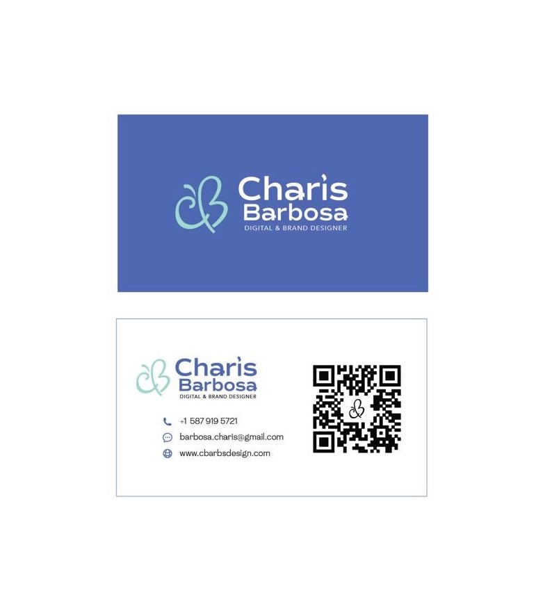
Business Card
The business card was designed to be clean and easy to read. The layout uses the brand's blue and seafoam colors. A QR code links directly to the portfolio for easy access.
Instructor Feedback
"Your logo demonstrates a strong sense of personal identity, especially through the hand-drawn initials and the organic, flowing shape. The butterfly-like form is a thoughtful visual metaphor for growth and transformation, and aligns well with your narrative of evolving as a designer."
— Course Instructor, Portfolio Development, NAIT